UI/UX design journey
BoldContacts has a UI/UX design journey that emphasizes the user's needs.
The UI/UX design journey started when my mother-in-law was diagnosed with Alzheimer's Disease, and my stepfather was diagnosed with Parkinson's Disease, and both parents were diagnosed with eyesight impairments.
Both parents loved using their iPhones, especially for keeping in touch with friends and relatives via phone calls and FaceTime.
Unfortunately, both parents were having a harder and harder time using their iPhone Contacts app.
I wanted to help them both, so I began to learn about their needs and abilities, and developed BoldContacts.
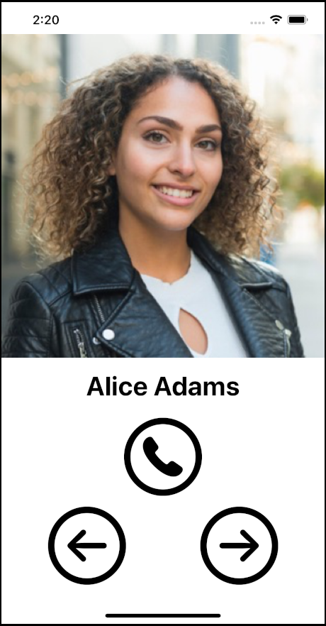
To understand the journey, it can be helpful to start with a look at the typical iPhone Contacts app, and how it led to BoldContacts.
iPhone Contacts app
The default iPhone Contacts app list page looks like this:
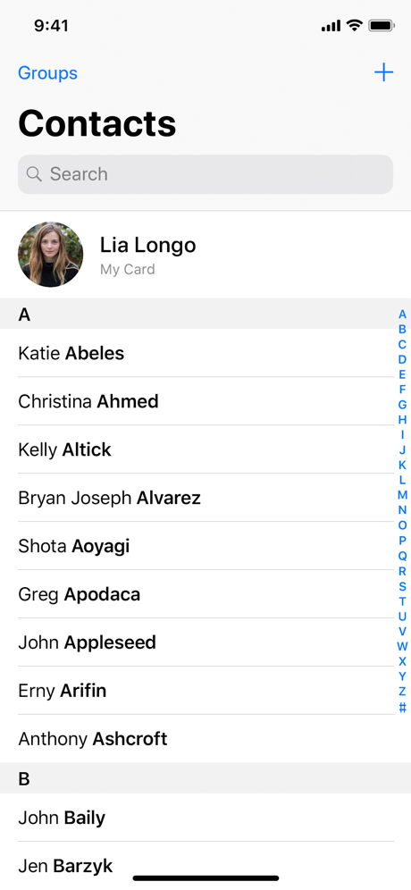
iPhone Contacts app issues
Unfortunately, Alzheimer's Disease, Parkinson's Disease, and Age-Related Macular Degeneration (AMD) often cause impairments making it hard to use the default iPhone Contacts app:
- Alzheimer's Disease often causes cognitive impairment, including memory issues. My mother-in-law started having trouble remembering how to unlock her iPhone, how to launch the default iPhone Contacts app, and how to connect via phone or FaceTime.
- Parkinson's Disease often causes motor impairment, including hand tremors. My stepfather started having trouble using the iPhone icons, trouble navigating the iPhone Contacts app, and trouble tapping the various buttons and links.
- Age-Related Macular Degeneration often causes vision impairment, including blurred vision and less than 20/20 vision. My folks started having a hard time seeing the iPhone text, even with Apple's accessibility font scaling turned up.
As their diseases progressed, they lost their ability to use the default iPhone Contacts app. This loss cut them off from their video calling. This made them sad, lonely, and more confused.
What I learned pretty quickly is that millions of people are affected by cognitive/motor/vision impairments, and many millions more will be affected within the next ten years. The need for a better solution now is very large, and the need for a roadmap to the future is also very large.
Attempt 1: Look for accessibility apps
I looked through many Apple App Store apps, to try to find any easier way of making phone calls and video calls.
I found a bunch of potential alternative phone dialer apps and evaluated them:
- Many of the apps provided more information on each screen, such as for salespeople making many business calls. These apps didn't work for most of the users.
- A few of the apps did provide easier ways to call, but had problems such as recent negative reviews, or a lack of maintenance, or a requirement for buying a new iPhone to run the newest iOS.
- Key learning: Bold big buttons help, and are significantly easier to see and tap than Apple's default buttons.
After much searching, I concluded that there wasn't a viable app.
Attempt 2: Voice control & Amazon Echo Dot
Because of the dementia, and hand tremors, and macular degeneration, my next attempt was to try voice control, using the Amazon Echo Dot:
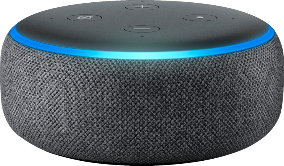
Unfortunately, most of the users weren't able to understand voice control.
- For example, my mother-in-law had never used voice control before, and didn't understand the overall concept of talking to the room.
- For example, my stepfather had used Amazon Alexa voice control for years to play his music. But he lost the ability to remember how to trigger Alexa.
- Key learning: a physical device with touch is easier to understand than room-wide voice control.
After many tries, I concluded that voice control was too confusing for users. At the same time, I saw them both able to reliably dial their land-line push-button phones. So I searched for a physical solution.
Attempt 3: Dedicated device & Facebook Portal
Because most of the users were still able to use their physical phones to some degree, I searched for a physical device that worked more like a desktop phone. After talking with many of my friends, including friends from Facebook, I found the Facebook Portal:
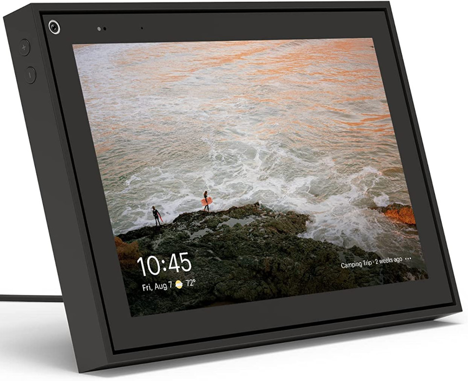
Unfortunately, the Facebook Portal is quite confusing, even to me.
- I tried the setup process for more than hour, and hit many UI/UX glitches and one severe bug. Even once I succeeded, the Portal tried to do much more than they needed.
- Because of the physical weight and shape, the Facebook Portal wasn't easy to carry around, nor put in a purse, nor mount to a wheelchair.
- Key learnings: users preferred the larger screen size of the Portal 10" over the smaller screen size of the iPhone, and also sometimes liked using the desktop stand capability.
After a week, I returned the Facebook Portal. In my opinion, the Portal is a great concept, but with too many UI/UX problems. I'll be surprised if Facebook continues to sell it.
Attempt 4: Dedicated demographic & Grandpad
Because one of the issue correlations is that users are elderly, I searched for an elderly-specific solution. Eventually found the Grandpad, which provides a dedicated tablet, with a dedicated mobile connection, and elderly-specific software:
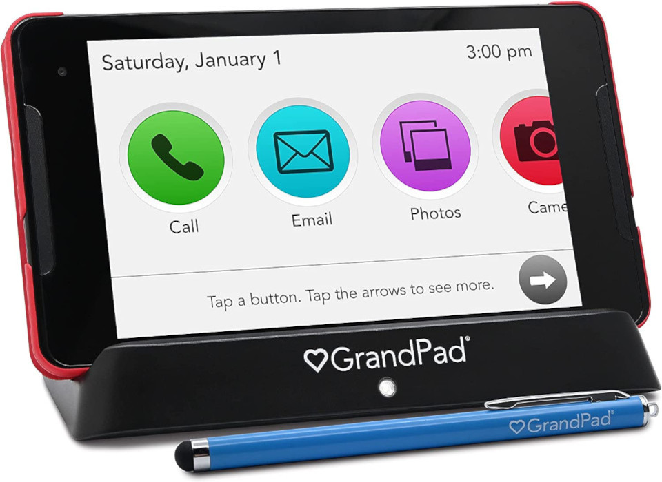
The Grandpad works well, and the team is highly helpful. Unfortunately, it fell short for users' specific needs:
- The Grandpad comes with its own mobile phone service, which has a significant monthly cost.
- The Grandpad was confusing to caregivers, because they'd never seen one, and couldn't quickly figure out how to set it up.
- Key learnings: to be adopted by caregivers, it's a must-have to use commodity devices (iPhones, iPads, etc.) and to use free WiFi.
The Grandpad was close, but not quite. What I learned is that a great solution needs to be able to use free WiFi, rather than requiring a mobile phone monthly payment. And a great solution needs to be something very easy for caregivers to understand and use.
BoldContacts sketches
I started the BoldContacts sketches informed by the default iPhone Contacts app person page, which looks like this:
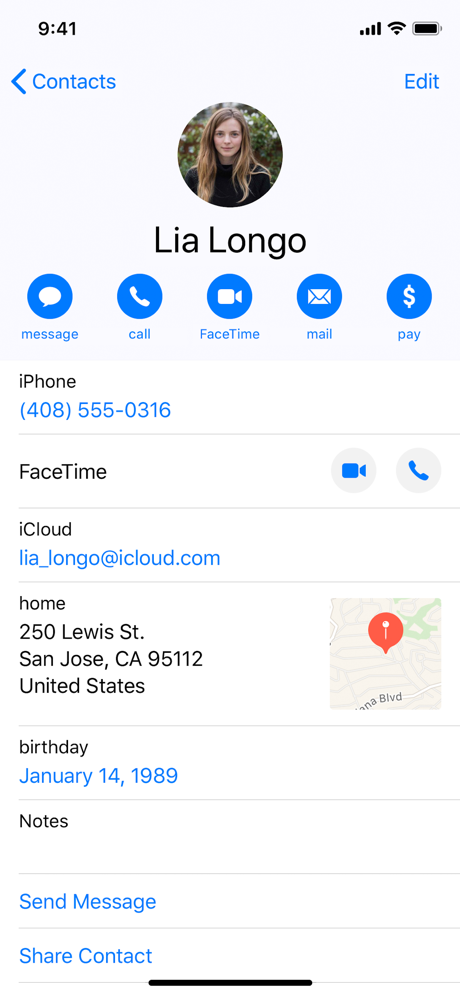
When I started sketching, I tried these steps first:
- Drop unneeded information, such as the postal address map section, email address section, birthday section, etc.
- Remove duplicity, such as the page showing a FaceTime icon near the top, plus the "FaceTime" area.
- Don't use links, such as "Send Message" and "Share Contact", because users didn't understand that the links are tappable.
BoldContacts functionality
Thanks to all the attempts, I had a good idea of what a solution needed:
- Bold big text that is especially easy to see, because this helps people with eyesight problems.
- Bold big buttons that are especially easy to tap, because these help users with tremor problems.
- Usable on a typical iPhone and iPad, because these match what caregivers know and use.
- Usable with existing free WiFi, rather than requiring sign up for a new cellular contract.
Iterations for users
I started coding and iterating with users and caregivers, and learned more about the user needs:
- The number of important contacts is small, typically 9 people or fewer. The important contacts were immediate family members, best friends, and some healthcare providers.
- The app must be free, because any kind of payment is too complex for the user.
- For some users, the device needs extra protection, such as a drop-proof spill-proof case.
- Caregivers strongly want options for form factors, such as an option for a tabletop stand, an option for a wall mount akin to a picture frame, and an option for a wheelchair attachment.
Iterations for Apple iOS
I learned more about Apple iOS, the Swift programming language, and the SwiftUI framework:
- Some of the typical Apple mobile UI/UX interactions do not work well for many users, especially invisible interactions. For example, press-drag-scroll is used in the Contacts app for scrolling up and down through the contacts list; this was confusion, and worse, did not function reliably when the user had hand tremors.
- Some of the Apple security restrictions make it hard to use a cloud-based database, but easy to use the user's existing iOS contacts database.
- Some of the current Apple iOS coding practices won't run on older equipment, such as a six-year-old iPhone or iPad, which cannot run the current iOS. But many of the users have these older devices, and cannot afford to buy a new iPhone, or cannot figure out how to set up a new iPhone.
- Many older devices are cheap and easy to procure. In fact, many users had family members who had an older iPhone or iPad that wasn't being used, and could be transferred to the user.
Simpler is better
I iterated more and learned in many cases, very simple UI/UX tends to works better for the users:
- Use one page for the whole app, rather than multiple pages such as a contacts list page plus a contact person page.
- Spread all the buttons far apart, to make it easier for the user to tap the one they want.
- Display the photo as large as possible, because this helps many users identify the person better/faster, and also provides a feeling of delight.
- Interface elements based on black and white tend to be easier to learn than interface elements based on colors, gradients, grays, and the like.
- Alphabetic sort by first name is easier to understand than alphabetic sort by last name.
- Each contact person typically has one preferred contact method, such as always via a phone call, or always via FaceTime.
- Some users have a very strong preference for their native language. Therefore, internationalization and localization are very important.
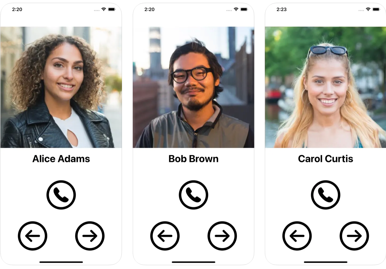
Success!
The result of all the attempts, research, iteration, and testing, is BoldContacts version 1:
Key results:
- The big main photo provides delight and recognition.
- The bold font is easy to see.
- The bold buttons are easy to see and easy to tap.
- The app uses one page layout, rather than multiple page layouts for a contacts list page that drills into a contacts person page. The app's entire functionality is always available on the page, and in addition navigation easier to understand and use.
- Each contact has one preferred way to call, rather than many ways. The one way can be customized by the user or carer, to use a phone call, or FaceTime video, or any custom URL.